The Art of CSS Art

Hello there all! Bingeh here, bringing you another article on a pretty cool topic. Today, I'll be writing about how I got started with CSS art, after finally letting myself cut CSS some slack.
We'll be going through why I decided to dabble in CSS art, why I think it's really cool, and how you can easily start making art of your own. You might've seen some pretty neat stuff on codepen and Twitter. Some look like they took eons to create, and it kind of discourages people.
CSS: Friend or foe?
For a very long time, I had trouble with CSS. I still do, because we can never really touch all points of such a huge aspect. Could I pull out a simple website with HTML and CSS? Yes. Now, ask me to make it responsive, and watch me die.
I mostly blamed my foundation because I jumped into bootstrap too quickly without covering reasonable ground in CSS. Stick with the fundamentals first, kids. Frameworks are shiny and all, but you never really know the why's and how's of a language if you don't take it from the ground up.
I recently just found out about this cool monthly CSS challenge on Twitter, and something just made me look into it. What other way to dive into CSS than a little fun activity? I decided that the challenge would be a starting point, and I publicly committed to it without any prior knowledge about CSS art. Even though I didn't make anything for the challenge, I owe any progress I've made to it.
I must remind you though, that I'm totally new at this. If I used anything that doesn't look right, please mention it in the comments :)
CSS Art Sucks!
Believe me, it doesn't. A lot of people think it's a waste of time, and that those who spend their time are basically just... spending their time. For only the first few times that I've tried to make something, I found it fun! Therapeutical even.
It's a great way to learn about CSS notions like ::before, ::after (I had no idea how these worked before), and even the famous relative and absolute positioning that many people struggle with. There are also transitions, transformations, and much more that you can learn while trying to make simple stuff.
And it's easy to get started.
How easy?
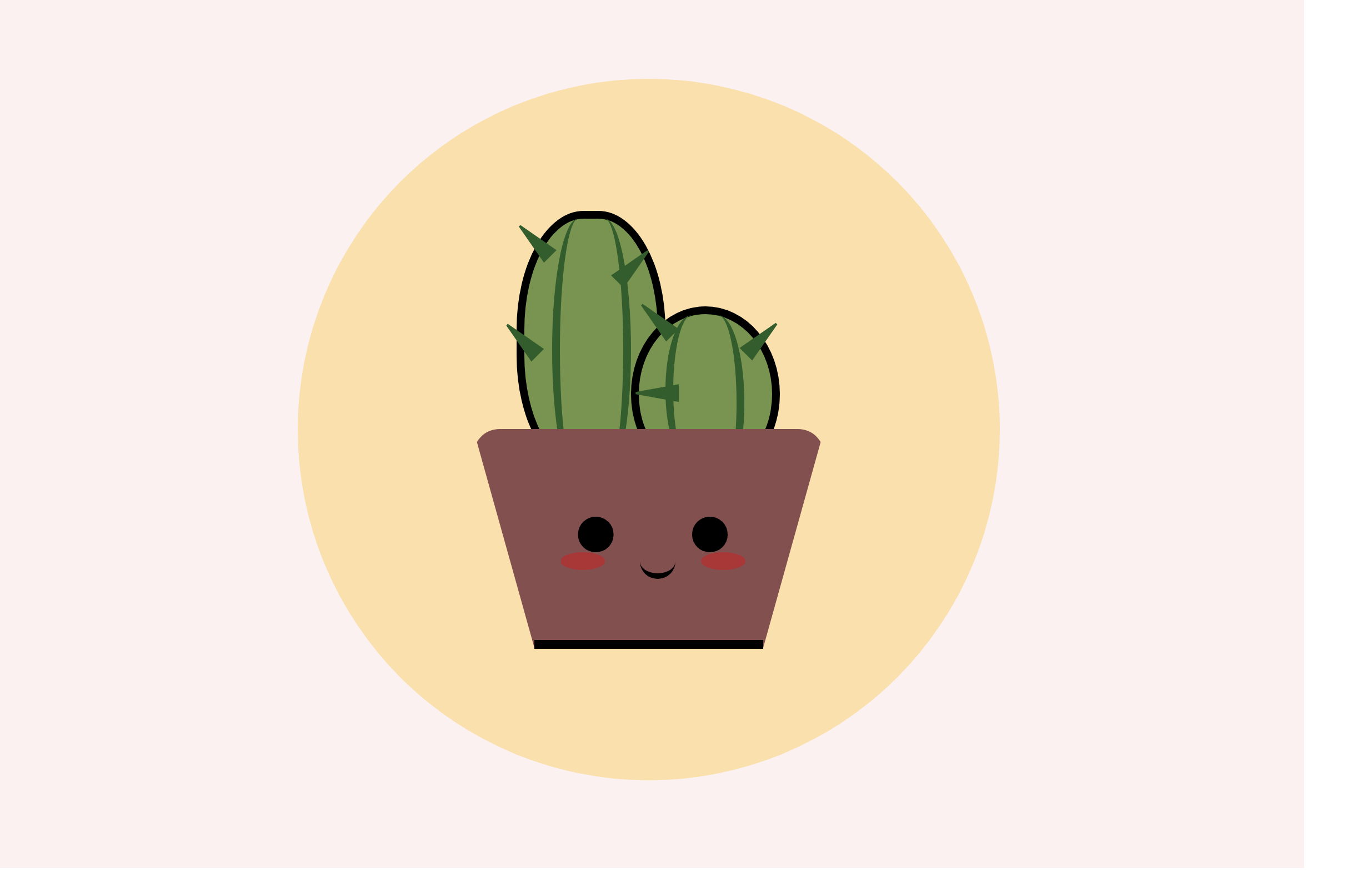
At this juncture, I'll show you how I created a lighthouse with CSS after watching my first tutorial. My first one was this cactus plant, and the tutorial is what made me feel confident about making something of my own.
I recommend the video to anyone who wants to try it out. The process is beautifully explained here.
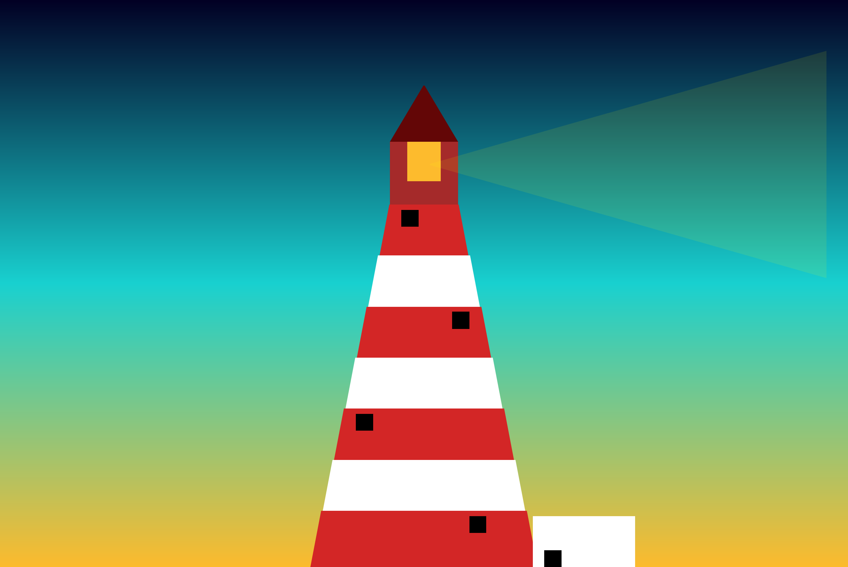
Back to our lighthouse. This is what the final thing looks like,

I was really proud about actually starting and finishing it, and to me, it looked kind of nice (I think). I had fun creating this, and I'm so grateful for the love it received when I posted it on Twitter.
Step 1
You have an idea. It could come from anywhere really. Even if you can't think up what to create, check out simple images on google, or look at Pinterest boards for inspiration.
Step 2
Draw what you want the outcome to look like. It doesn't have to be beautiful or too specific. Just a rough sketch to see the different shapes involved.
Step 3
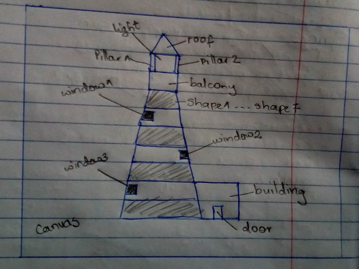
Define the layers. Layers are like different portions of the product that need styling.
As you can see below, my lighthouse now has some annotations to it. There's the canvas, which is like the body and everything else comes on top. You could call it something else if you want. I then break each shape on my lighthouse into a separate layer for easy styling.
Step 4
Pick your colors. Unless you want your final product to be a series of shapes with no touch of color, you can skip this step. You already have in mind what you want your art to look like, you just have to find the closest best shade of colors that you want. For this, I use color hunt or ColorHub, which are two great platforms that offer free palettes.
For my lighthouse, I chose shades of red, white, yellow, and a nice gradient to substitute what was supposed to be the night sky in the background.
Step 5
Open your code editor! We're going to start with a pretty simple HTML and CSS file. Those are the only two we need.
HTML In the HTML, each shape or part that we labeled as a layer, will be a div. I start from the outside layers, and then from top to bottom. You could do this from bottom to top, and I think it'll work out fine.
<div class="canvas">

        <div class="roof"></div>
        <div class="light">
            <div class="pillar1"></div>
            <div class="pillar2"></div>
        </div>

        <div class="balcony"></div>
        <div class="shape1">
            <div class="window1">
            </div>
        </div>
        <div class="shape2"></div>
        <div class="shape3">
            <div class="window2"></div>
        </div>
        <div class="shape4"></div>
        <div class="shape5">
            <div class="window3"></div>
        </div>
        <div class="shape6"></div>
        <div class="shape7">
            <div class="window4"></div>
        </div>

        <div class="building">
            <div class="door"></div>
        </div>


    </div>
If you look at the code, you see that the canvas which acts as the underlying surface with everything on top, is the div that surrounds everything. Inside our canvas, we have the uppermost layer, which is the roof. After the roof, we have the light, which in my mind is the light source. In order to style the pillars easily, I put them inside the light div, and we'll use CSS to position them around the edges.
So basically, shapes or structures that seem to be 'inside' each other on your sketch, are represented as nested divs. You can see this in the code where I added divs for the windows, and door in the building.
CSS Time to make our divs come alive!
We just have to agree that it'll be illegal to not begin your CSS like this. But seriously, this just tells the browser to account for any border and padding in values that you specify for height and width of an element (read more)
*{
    margin: 0;
    padding: 0;
    box-sizing: border-box;
}
We then want to style the canvas. We give a height and width, and then use the famous flex properties to make sure that whatever we make in this container will be centered. It's a neat way to center a div. And finally, we have our gradient background. I found the gradient here, and it's a cool site that lets you generate your own gradients. My units of measurement here are not standard. vmin and vmax are unpopular, but useful because they define the size of HTML elements relative to the dimensions of the viewport. Feel free to use pixels or any other units.
.canvas{
    height: 100vh;
    width: 100%;
    display: flex;
    justify-content: center;
    align-items: center;
background: linear-gradient(0deg, rgba(253,187,45,1) 0%,rgba(25,209,208,1), rgba(2,0,36,1) 100%);
}
Moving on, I started styling my lighthouse from the last shape, which is shape7. For the shapes that I use here, I use a website called (the shapes of CSS)[https://css-tricks.com/the-shapes-of-css/]. They have ready-made CSS snippets for widely used shapes. My seven shapes will basically consist of 7 trapezoids, stacked on each other.
.shape7{
    position: absolute;
    bottom: 0;
    border-bottom: 10vmin solid #D32626;
    border-left:2vmin solid transparent;
    border-right: 2vmin solid transparent;
    height: 0;
    width: 40vmin;

}
In my shape7, I decided to look away from my sketch, and add a window. Like I said, your sketch doesn't have to be the final thing. The window is positioned absolutely so that it overlaps its parents.
.window4{
    position: absolute;
    width: 3vmin;
    height: 3vmin;
    background: #000;
    right: 7vmin;
    top: 1vmin;
We move on to shape6, which is the same case for shape7, but with a lesser width.
.shape6{
    position: absolute;
    bottom: 9vmin;
    border-bottom: 10vmin solid #fff;
    border-left:2vmin solid transparent;
    border-right: 2vmin solid transparent;
    height: 0;
    width: 36vmin;
}
For the rest of the shapes, it's repetition.
.shape5{
    position: absolute;
    bottom: 18vmin;
    border-bottom: 10vmin solid #D32626;
    border-left:2vmin solid transparent;
    border-right: 2vmin solid transparent;
    height: 0;
    width: 32vmin;
}

.window3{
    position: absolute;
    width: 3vmin;
    height: 3vmin;
    background: #000;
    left: 2vmin;
    top: 1vmin;

}

.shape4{
    position: absolute;
    bottom: 27vmin;
    border-bottom: 10vmin solid #fff;
    border-left:2vmin solid transparent;
    border-right: 2vmin solid transparent;
    height: 0;
    width: 28vmin;
}

.shape3{
    position: absolute;
    bottom: 36vmin;
    border-bottom: 10vmin solid #D32626;
    border-left:2vmin solid transparent;
    border-right: 2vmin solid transparent;
    height: 0;
    width: 24vmin;
}

.window2{
    position: absolute;
    width: 3vmin;
    height: 3vmin;
    background: #000;
    right: 2vmin;
    top: 1vmin;

}


.shape2{
    position: absolute;
    bottom: 45vmin;
    border-bottom: 10vmin solid white;
    border-left:2vmin solid transparent;
    border-right: 2vmin solid transparent;
    height: 0;
    width: 20vmin;
}

.shape1{
    position: absolute;
    bottom: 54vmin;
    border-bottom: 10vmin solid #D32626;
    border-left:2vmin solid transparent;
    border-right: 2vmin solid transparent;
    height: 0;
    width: 16vmin;
}

.window1{
    position: absolute;
    width: 3vmin;
    height: 3vmin;
    background: #000;
    left: 2vmin;
    top: 1vmin;

}
You can notice, that as I move up, I reduce the trapezoid's width by 4 and increase the height from the bottom by 9, to make sure that the shapes stack perfectly.
For the balcony, it's just a square.
.balcony{
    position: absolute;
    width: 12vmin;
    height: 5vmin;
    background: brown;
    bottom: 63vmin;
}
I liked the light part of my art, because it helped me explore a new concept. ::after pseudo-element. The name is kind of self-explanatory. It's used to add content to (or after) an element with the content property. As seen below, I used .light::after to add a flashlight kind of effect to my light. In the final product, the flashlight comes 'after' the light element.
.light{
    position: absolute;
    width: 12vmin;
    height: 7vmin;
    background: rgba(253,187,45,1);
    bottom: 68vmin;

}

.light::after{
    content: "";
    position: absolute;
    width: 0;
    height: 0;
    bottom:-17vmin;
    left: 7vmin;
    border-top: 20vmin solid transparent;
    border-right: 70vmin solid yellow;
    opacity:10%;
    border-bottom: 20vmin solid transparent;
}
The final parts just included the pillars, the roof, the building by the side, and its door.
.pillar1{
    position: absolute;
    width: 3vmin;
    height: 8vmin;
    background: brown;
}

.pillar2{
    position: absolute;
    width: 3vmin;
    height: 8vmin;
    background: brown;
    right: 0vmin;
}

.roof{
    position: absolute;
    width:0;
    height: 0;
    bottom:75vmin;
    border-left: 6vmin solid transparent;
    border-right: 6vmin solid transparent;
    border-bottom: 10vmin solid #630606;
}

.building{
    position: absolute;
    width: 18vmin;
    height: 9vmin;
    left: 84vmin;
    background: #fff;
    bottom: 0vmin;
}

.door{
    position:absolute;
    width: 3vmin;
  height: 3vmin;
  background: #000;
  bottom:0;
  left:2vmin;
}
Our final thing is complete. Sorry if the snippets are too many, hence hard to go through.
And there you have it! Some people make really cool art, and just looking at it makes CSS art seem like something impossible to do. This one was kind of easy for me to start with, and I hope I can move on to really cool ones. I'm still pretty new at this, and I appreciate feedback of any kind.
But if after reading this, you feel like getting started with CSS art, this is the link I used to get started.
I hope I get to write more CSS art articles as I go on, because like I said, it's my way of channeling what little creativity I have (I suck at drawing). If you want to see me create cool stuff (it might not be as cool), consider following my journey on Twitter


